For the past 2 weeks we’ve been implementing the UI.
Here it is.
I’m breaking this up into multiple parts: Build Menu, Object Windows, and HUD. I’m only going to talk about the Build Menu in this post. Next week I’ll talk about Object Windows and possibly the HUD (depending on how long the post becomes).
Positioning Elements
Placing buttons, images, and text into the proper location is probably the most fundamental part of a UI.
Categories
The entire UI is composed of “categories”. A category is essentially a hierarchy that describes where a UI element should be placed. An example category might be:
Build Menu > Summary > Palette
This would instruct a new element to be placed on the palette area of the summary area of the build menu.
I’m just going to call these “slots” from now on. So I’ll say, “the button is looking for its slot at ‘Build Menu > Summary > Palette’.
Slots Everywhere
Every single Unity GameObject can potentially become a UI slot. When the game first starts, there is only a single UI slot: Game Menu. All other slots are created at runtime as UI objects are placed.
For example, the toolbar is placed when the game first starts. It looks for the Game Menu slot. Once placed, the toolbar becomes a new UI slot: Game Menu > Toolbar. Toolbar buttons are then placed, and they look for Game Menu > Toolbar.
Here’s a gif to show you. There’s not much context, so let me try to explain it.
Game starts (blank screen)
Toolbar is placed on Game Menu
Toolbar creates new slot: Game Menu > Toolbar
Toolbar buttons are placed on Game Menu > Toolbar
Toolbar buttons are placed on the toolbar
By the way, if a toolbar button was placed before the toolbar, they wouldn’t know where to go. We solve this by making the toolbar responsible for spawning the toolbar buttons. This way, the buttons can never spawn before the toolbar.
Populating Elements
The UI in Starmancer poses a challenge, because every object in the game can do something unique. For example, beds can change their color and ore refineries require power. The UI has to work for everything.
More Slots
There’s a similar “slot” system for populating values.
It works like this:
Window is created
Window is populated with an agent
Agent provides all of the data that it wants to. The data is in the form [Slot] - [Value]
The window does whatever it wants with the data
For example, when you mouse over a toolbar button, a tooltip is displayed. The toolbar button provides the following data: [Tooltip Label] - “Hull”
The tooltip window has a slot for “Tooltip Label”, so it populates the data.
Here’s an example.
Tooltip text is populated automatically
Data is ignored if there’s no slot for it. So multiple windows can be populated with the same agent and completely different information can be displayed.
Translating Text
This seems like a logical place to bring up text translation.
Let’s say that a button has the label “Hull” and that you save that word “Hull” to some external file.
There could be lots of text in that file, so you need some method for identifying which word corresponds with each agent.
Because of this, we save all text as an integer that corresponds with the line where the text exists in the big text file.
Let’s say that “Hull” is assigned the text value 228. This would mean that the text at line 228 is the text that we want to use as our button label.
Anyone could edit or replace the big text file and a different word could be used.
All text is stored in one big file.
If I changed line 228 to “Something Other Than Hull”, the game would load, and the hull button would use the new text.
Apparently the tooltip doesn’t work well with really big text, unlike this caption, which can handle lots and lots of text
Complex Elements
Populating images and text in isolation is fairly simple, but most elements are composed of sets of related values.
For example, the power display in the summary window is composed of [Icon] [Header] [Value], like so:
Most elements are composed of “sets” of values
When you populate a simple image, you’re passing in data to a slot. The data is an image. The same concept is still used here, except the data is an array of Slot-Data pairs.
In the case of the power display, the following set of values are passed:
Icon : <Minus Icon>
Header : “PASSIVE POWER: “
Label : “20 / Min”
The GameObject used by the power display has slots for all of those simple values, and they’re populated.
Components Populate
By the way, internally, an event named “QueryPopulationElements” is used. Any component can subscribe to this and provide whatever data they want. In the case of a “Powered Object” there’s a component that provides the power usage icon, header, and value.
Filtering With Categories
The Category / Slot system is used for positioning UI objects, but it’s also used for conditionally “filtering” which UI objects to create.
An example filter might be:
Build Filter > Objects > Water
This would signify that only objects within Build Filter > Objects or Build Filter > Water should be displayed.
Specificity
This might be confusing, because obviously Build Filter > Objects > Water is within Build Filter > Objects, but for filtering, specificity matters.
Internally, when the filter changes, each object is queried. They essentially say something like, “hey, I’m looking for all of the following, does the new filter meet my minimum requirements”.
So a toilet might be looking for Build Filter > Objects > Water. When the filter value is only Build Filter > Objects it’s not specific enough. It doesn’t meet the minimum requirement for the toilet.
By the way, each category is on a separate layer. Build Menu is a layer and so is Build Filter. A change in Build Menu does not affect anything that cares about Build Filter. From now on, I’ll label categories as [Layer]: Category > Category > Category.
Changing Filters
Most of the UI buttons change the Build Filter. Selecting the hull button changes the filter to [Build Filter] : Hull.
This displays all of the “Hull” UI objects. In this case, it’s the buildable floors and walls. It also displays all of the “SubCategory” buttons for the relevant filter, which in this case would be any button with [Build Filter]: <Empty>.
Filters are used to conditionally display UI objects
Besides for displaying objects, there are also components for playing animations and toggling buttons whenever the filter changes.
(The fonts aren’t final yet)
Searching
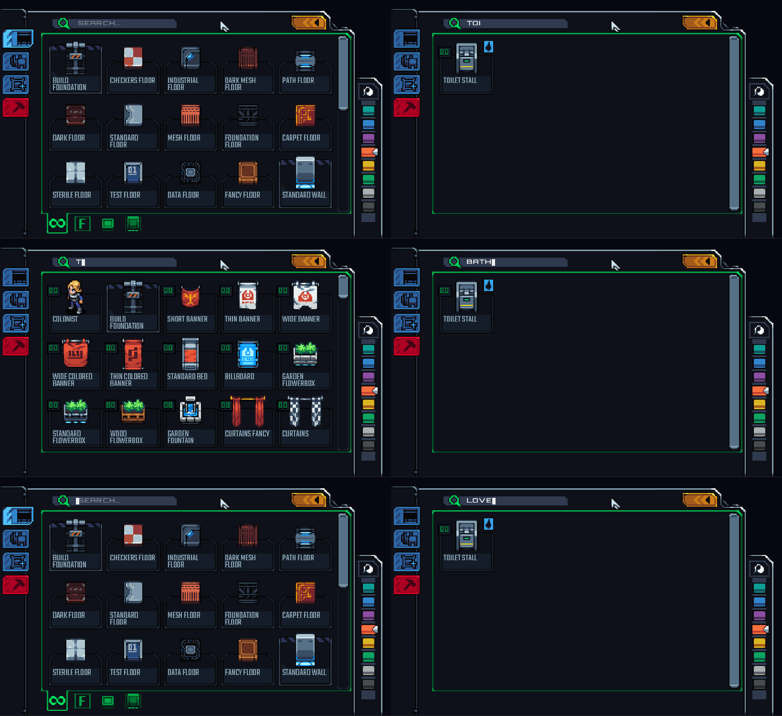
As the player you can also filter objects by typing into the search bar. This changes the filter to [Build Filter] : <Empty> and adds “Filter Text”. Filter text is another system that essentially says, “I’m looking for the following category hierarchy, and I also require the following text to be present”.
Partial or exact matches can be specified
Order
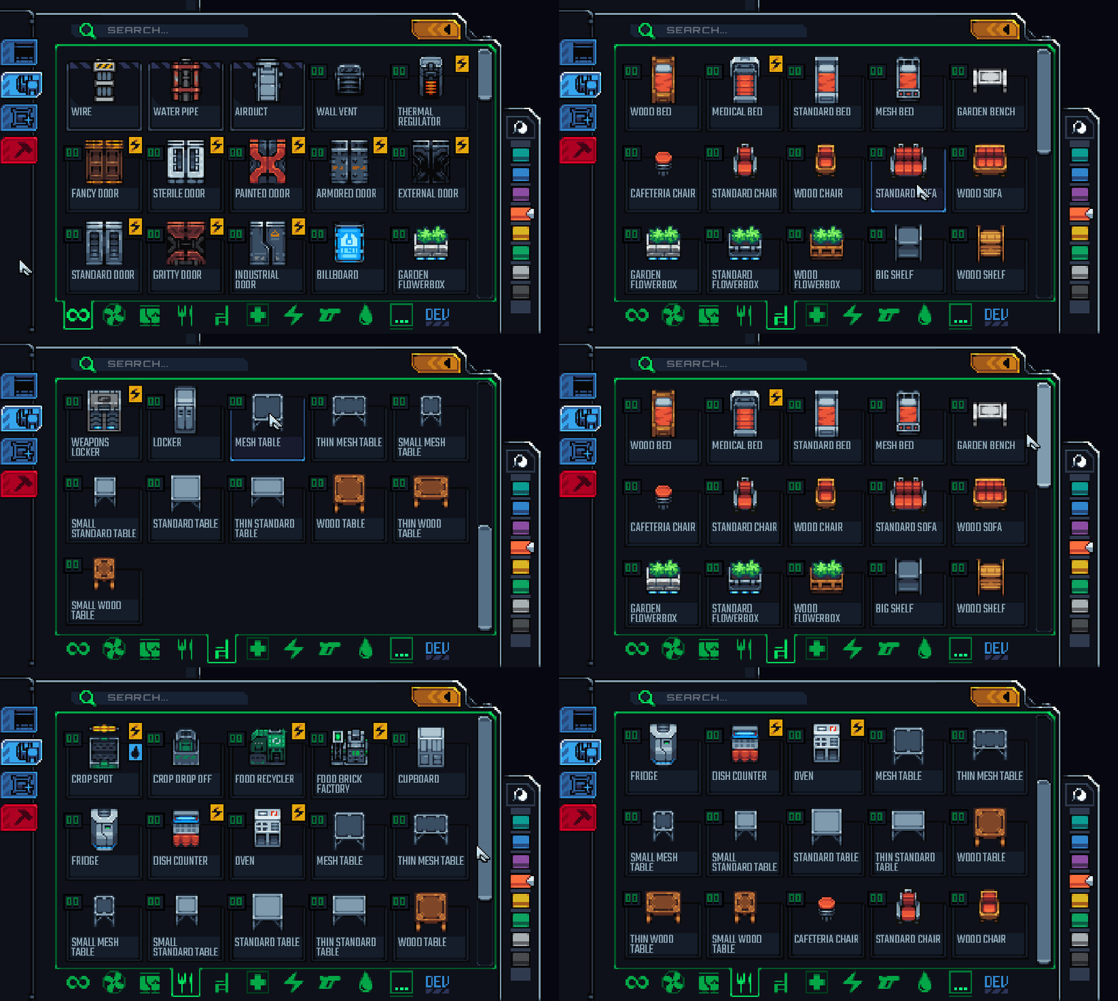
Object order is specified with a “sorting value”. This allows us to sort buildable objects into an order that makes sense. We keep beds near each other, for example.
The order is different for each filter too. Chairs are shown aboves tables in the “Furniture” filter, but tables are shown above chairs in “Food”. This is because we assume that chairs are more important when looking for furniture-related objects and tables are more important when looking for food-related objects.
Unique orders can be specified for each filter
Building
Okay, that’s the basics of the menu. Now I’ll show it in action. You don’t really need any explanations, so you won’t get any.
Palettes
We have lots of objects that can change their color.
Such color, wow.
Painting
You can paint walls again. The selection of wall sides is also much better than it was before.
Ignore the work-in-progress “cursor”
Foundation Tool
The tool used to expand your station is back.
The foundation tool surrounds a room with walls.
Deleting
Deleting has received an overhaul now as well.
I was worried that the floor under that wall was deleted
That’s It
That’s the basics of the build menu.
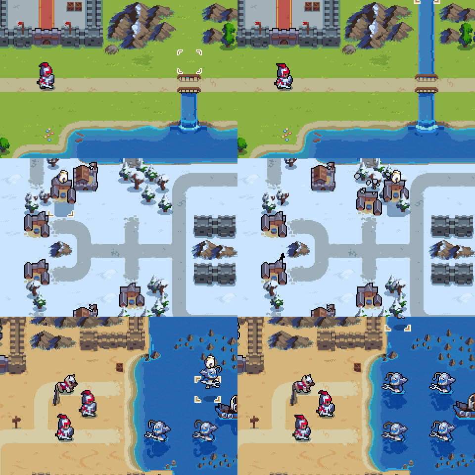
So goodbye, but before you go, check out Wargroove
Wargroove
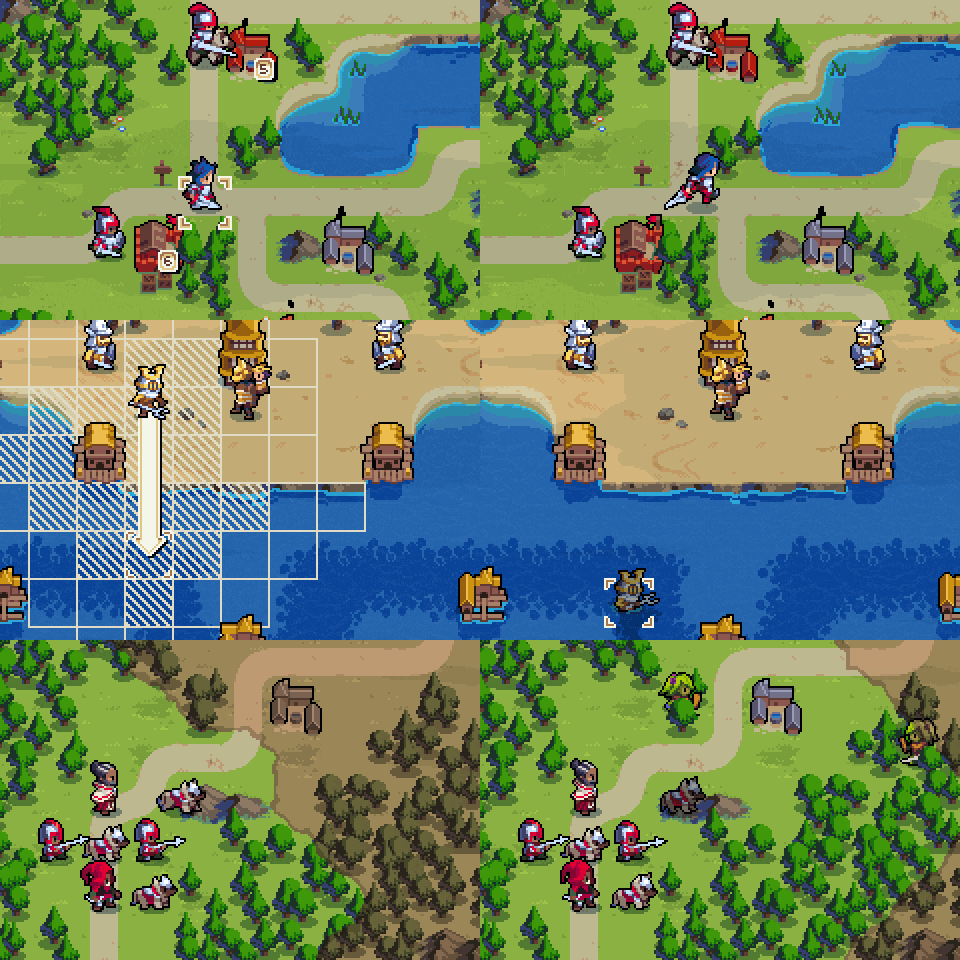
Wargroove is a new game developed by Chucklefish. You might know them as the developers of Starbound, and the publishers of classics like Stardew Valley and Starmancer.
Buy It!
It just released today for PC, Switch, Xbox One, and PS4 (soon).
Check out the website.
Wargroove offers over 50 hours of single player content. You can design your own maps, campaigns, and stories. Local multiplayer, online multiplayer, co-op play. Cross-platform play. Complete rule customization.
Do you you want to see more indie games with this level of polish and complete feature set? Support the indie game market. Buy 10 copies of Wargroove today.
p.s. If anyone from Chucklefish is reading this, send some free keys to ominuxgames@gmail.com
-Tyler
